Enter
the following data in the appropriate cells. Enter
the following data in the appropriate cells.
Select
the data by using a block (continuous or non-continuous), for the exercise,
from A1 to D4.
The data selection is very important. Avoid selecting empty
rows or columns. They will be added to the chart and leave empty spots in your chart. Use the instructions in the Basic operations page to select only the blocks of cells that you need. Make sure that every range of cells selected represents at least a data series for the chart. Don't take single cells scattered everywhere on your worksheet.
Generally, the first row or row selected from the range of cells will be used by the chart for the description
of the X axis. The content of the first column from the range of cells will be used as the description for the legend of the chart. But, Excel will be confused if the description that you need for the X axis are numbers.
From
the Insert menu, select the Chart option.
OR
Use Excel's chart assistant by pressing the  button. button.
Answer
the questions that you will be shown in the next windows.
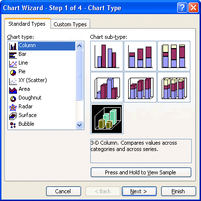 |
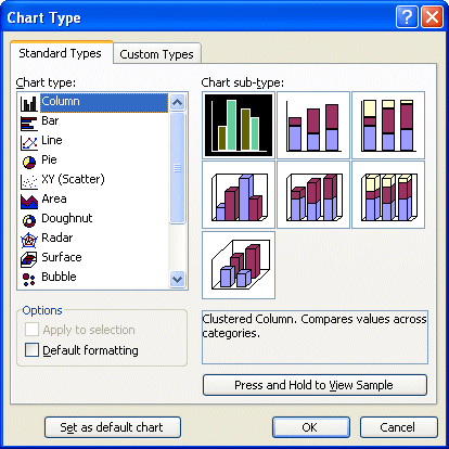
The first stage consists in choosing a chart
from the 14 categories that are represented in the left column. In the
right part of the screen, there are subcategories to represent
the same data in a different ways.
These subcategories are alike, but will give a different representation
from the same data. The first row shows the data in two
dimensions (2D). The second row shows these same data but in three
dimensions (3D). Furthermore, the first column shows the data series the
one next to another. The second column shows the data series
in cumulative mode (one on top of the other). The last column shows
the proportion of each of the series. Notice that each of the bars is
of the same height, only the proportion of each series changes.
Before continuing, you may have a preview of the chart to
make sure to have chosen the right type of chart to better to represent the
data. Press the button "Press and Hold
to View Sample" to have a preview of the chart. The section with the subcategories of chart will be replaced
by a representation of the chart. You can try different types of charts before going any further and preview them. |
Make
you have the right selection. For the exercise, select from the Column charts, the 3-D Column option.
Press the Next button.
For the second step to create a chart has two tabs: the
one to determine the range of data (Data range) and the other to look of the data series.
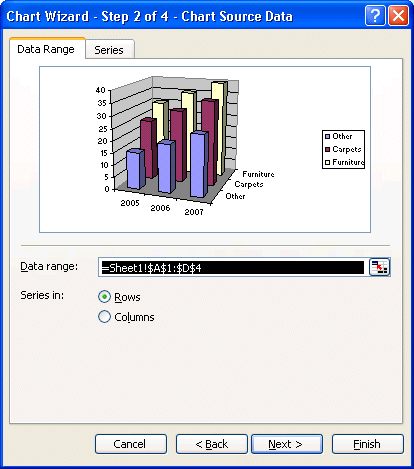 |
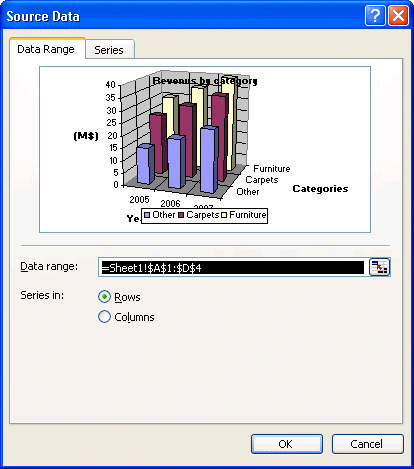
The Data range tab is there to make sure that
you chose the right area of cells as the data series of your chart. If
there is an error, you can always press the button at the end of the
box to re-select the cells you need for the chart. You can determine that
the data series are in columns or in rows. This means that every row
or every column represent a data series on an item that you want to
represent in the chart. For the purpose of this exercise, make sure that the
data series are in rows and not in columns.
That means that every row from the range of cells you selected will be a data series.
You also have a preview of the final chart before having finished it! You
can experiment and see that will be the final result by changing the
representation of the data series. |
Click
on the Series tab.
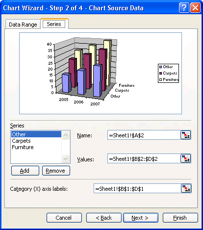 |
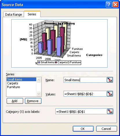
Under the Series tab, you may change, add or delete data series. In the bottom to the left
of the window, you have the name of each of the series. In the right-hand
side, the "Name" box allows you to change the name of a series.
It's that name that will appear in the legend of the chart. You
can select the content of a cell of one of the worksheets of
the file or you can write the text of your choice.
The "Values" box is an area of cells that contain the numbers you want to see in the chart for that data series. You can change the area at any time.
The "Category (X) axis labels" box indicates the description that will be shown
on the X axis of the chart. It's still possible to you to change
it. You just need to press the button at the end of the box and select
the cells that you wish for the X axis. You can also write the content. You need to place a semi-colon (;) between the text For example, orders could come from "In store";"Catalogue";"Internet". |
Make
your selection and press the Next button.
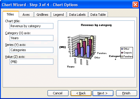
For the third step, there are several tabs. Each describes a characteristic
of the chart.
Click on the Titles tab.
Click
on the Axes tab.
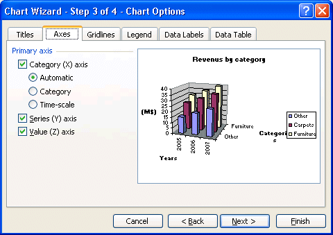 |
The Axes tab gives you the choice to show
or to hide the data of the various axes of the chart. For the moment,
leave all axis visible. |
Click
on the Gridlines tab.
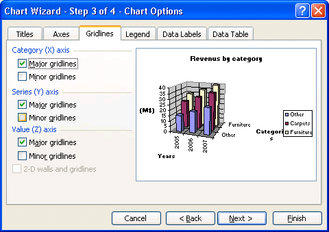 |
Gridlines help you compare items that are not close to each other. You compare them to the gridlines to see an upward or downward trend. Under this tab, you may show or hide the gridlines of the chart. For the purpose of this exercise, select the same options
as the picture; just activate the major gridlines for each axis. |
Click
on the Legend tab.
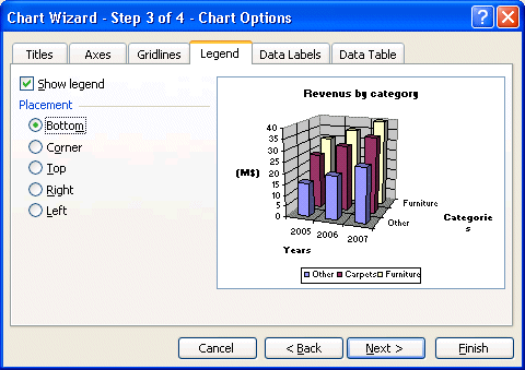 |
This tab allows you to show or not the legend
of the chart. It contains the names of each series of your chart with a color representation beside it. There, more you can decide on the position of the legend.
Select
the Bottom position. |
Click
on the Data Labels tab.
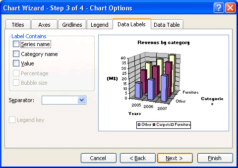 |
Under this tab, you may you to show
labels and values of each of the elements of the series. You can show the value, the
percentage, both or even the description of the X axis (series name). The big problem with this option is that it crowds the chart with too much information making it more difficult to read. One option is to activate the label you want but move them on the side of the bar instead of over the top of each bar. It gives more information without blocking the view on the trends or the proportions of the chart. |
For
this exercise, do not activate any options.
Click
on the Data Labels tab.
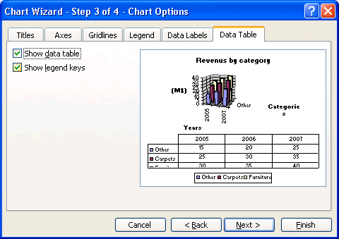 |
This is a recent addition to Excel. It's possible
not only to show a chart but also the numbers themselves
in a table below the chart. Select the Show the data table option to have a preview of the result. However, for the needs of the
exercise, don't show the data table. It will be shown how to show this
table, and how to personalize the chart farther on this page. |
For this exercise, do not activate the Data table.
Press the Next button.
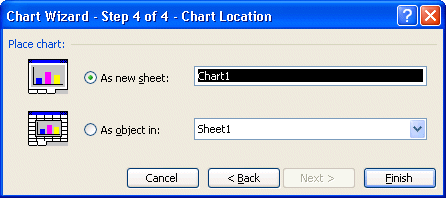 |
The chart assistant will ask you
a last question. Do you want this chart in a worksheet that
has numbers or on a new chart sheet? You can also give a name to this
new working sheet.
For
this exercise, select a new chart sheet that will be called Chart1. |
Press
the Finish button.
Excel will show you the finished chart with the options you selected.
Personalize the chart
Even if you finished the chart, it's always possible to personalize
it better to answer your needs. The next part consists in showing to
you some of its options and how to apply them.
The first stage consists in widening the space that's assigned to the chart.
Click on the chart only to select the part that's reserved for the chart.
Select
one of the squares dimension square on the border of the chart.
Press
the left mouse button and move the dimension square to the outside of the area
reserved for the chart.
You can, by selecting an object, that it's the chart, the title, the legend
or quite other object that meets itself in the area of chart, to move it or
to change it.
The chart changed dimensions. But, the text that meets itself on axes is still
too big for the rest of the chart. To change the size of the text, there are
three ways.
Place
the cursor on the X axis of the chart.
Double-click
on the axis.
OR
Click
on the X axis.
From
the Format menu, select the first option;
OR
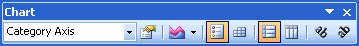
From the chart toolbar, select the Category axis from the list on controls on the chart.
Press on the Properties button . .
The window with the properties of the axis will appear
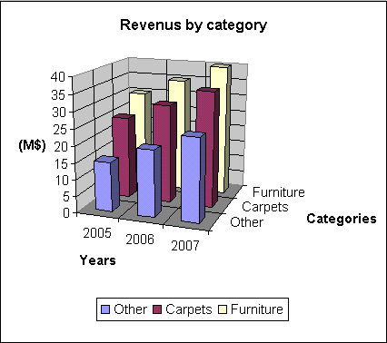
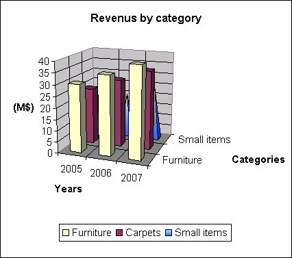
The result should look like the picture below.
This looks like a chart that you can put in a report or a document for a customer
or even to your boss. But you can even better. Excel offers several other options to improve the presentation
of a chart.
Changing options
To change an option of one of the objects in the chart, you
can click on it and choose from the Format menu the first
option. You can also double click on the object that you
want to change. Another way is to click the object and to press Properties button
on the Chart toolbar. Another option you can use is by placing
the cursor over the object and pressing on the right mouse button. A
list of the options most often used will appear. It's also called a
context menu.
Here is the short list of what you can make to change in the chart: move objects,
change their size, the color and the orientation of the text, change the color,
the pattern and the order of the series, insert some
free text, drawings, arrows, the square or any item from the Draw toolbar, etc. You can access all the options by using
the mouse or the main menu.
To stop changing options of the chart, click outside of the frame of the chart.
If you generated your chart on another worksheet, click the tab to
another worksheet.
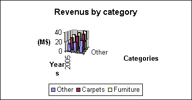
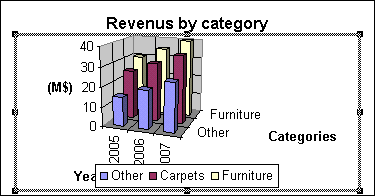
Change the legend's text
It's also possible for you to change the text that's in the legend. Here
is the legend before the change.
From
the Chart menu, select the Source data option.
Click
on the Data Range tab.
 |
Under this tab, you can change the area of the
data and change the data series of rows in columns or vice versa. |
Click
on the Series tab.
 |
Under this tab, you can add or remove data series to the chart. It's also possible to change the name of a
data series that appears in the legend, to change the range where the values are located and the description for the X axis of the chart. This exercise
consists in changing the name that seems to the legend for the series "Other".
From
the Series section, select the Other option .
The data about the series will appear in the boxes to the right of the
window.
Click
in the Name box.
You can write of the text or write the name of the cell that will be
the description of the legend.
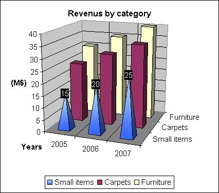
Write Small items.
Press the OK button. |
Here is the legend after the change.

Change the legend's placement or position
There are three ways to change the place: by using an option of the format
menu or the properties of the chart or manually by using the mouse.
Click
on the legend.
From
the Format menu, select the first option: selected legend.
OR
From
the Chart toolbar, select Legend from the list.
Press
the button of the properties.
Click
on the Position tab.
Select
the new location for the legend in the chart.
You can also move the legend by using the mouse.
Click on the legend
Place
the cursor inside the legend box.
Press
the left mouse button and move the box down to the bottom of the chart.
You can later change the size of the chart to take advantage of the space freed
by the legend.
Click on the chart.
A border with squares should appear around the chart. Otherwise, re-select.
Place
the cursor on the square of the middle right border of the chart.
Press
the left mouse button and move the square to the right-hand side of the screen.
Release
the mouse button.
You can so in this way by using the other squares to change the size of the
chart.
Change the size, the color and the orientation of
the text
You may change these options for all the boxes of text including
the one on the axes.
Click on the main title.
From
the Format menu, select the first option: selected title.
OR
Double-click on the main title.
Select
the Font tab.
Change
the options of size and color in your choice.
The next example consists in changing the orientation of the text of one of
axes...
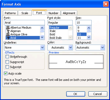
Double-click on one of the axes.
OR
Click
one of the axes of the chart.
From
the Format menu, select the first option: selected axis.
Click
on the Position tab.
Change
the vertical orientation of the text.
Press the OK button.
Change the color and the shade of bars
To highlight a data series, you may change its color
as well as its pattern. Furthermore, if you think of printing on a printer, you may need to change the pattern for each of the
series. Otherwise, the bars of the chart are all going to look the same. For example, a data series of the red color will be printed
with the same tone of grey as the one that's blue. Both will be printed
grey on a piece of paper. It may be better to distinguishing different data series to have
a different pattern for each.
Click
on one of the data series.
From
the Format menu, select the first option: Selected Data Series.
Click
on the Patterns tab.
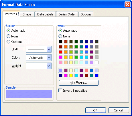
Press the Fill Effects button.
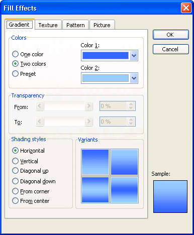
There are many ways to change the pattern on the bars of a Data series. Excel regroups them under four tabs: Gradient, Texture, Pattern and Picture. The Gradient tab able you to place gradient progressive patterns on the bars. The Texture tabs able you to place "natural" pattern from marble, wood and fabrics. The Pattern tab offers different types of stripes, rows and other regular patterns. The Picture tab offers you the possibility to apply an picture of your choice inside the Data series bar. Look at all the options and select the one that you need.
Change the color and the pattern for the Data series.
Select the Shape tab.
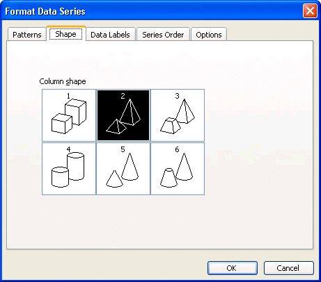
Not only can you change the patterns on the bars of the chart, you can also change the forms. You can choose from regular boxes to pyramids, cylinders and cones. Please take note that the only fill effects available for cylinders and cones are patterns, no gradient, texture or pictures for them.
Select the Pyramid type.
Press the OK button.
Change the series' order
From time to time, a data series is hidden by the others. Or you may wish to move a data series ahead of another. It's possible
for you to change the order of the data series to avoid this situation.
Click
on the series that you want to change the place in the chart.
From
the Format menu, select the first option Selected Data Series.
Click
on the Series order tab.
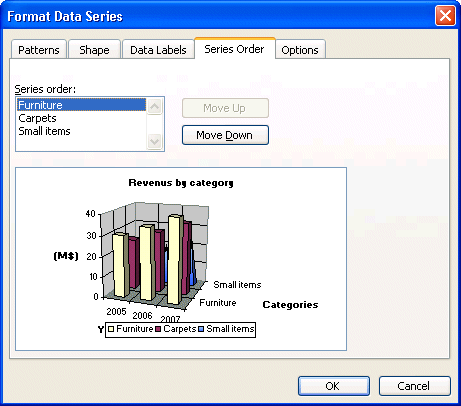
Select
the series of your choice from the left column.
Press the "Move up" or "Move down" button according to
your choice.
Once finished, press the OK button.
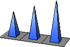
The more the data series is up on the list, the more toward the front of
the chart it will be. Here is the result according to the order of the previous
picture.
Replace
the series in its original location in the chart.
The data labels
You can show the value of the bar or the description of the axis of the various
data series.
Click on the first data series.
From
the menu Format, select the first option: selected data series.
Click
on the Data labels tab.
Press the radio button next to the Show value option.
Press the OK button.
The values that represent bars will appear above these. You can then
move them towards your choice. This option shows you the values of a series
at the same moment. It's possible to show the labels of all the series.
From
the Chart menu, select the Chart Options option.
Select
the Data labels tab.
Select
the Show values option.
Press the OK button.
The values of the series appear above bars. You can move them afterward and
change their format.
Remove
all labels.
Insert an pictures
It's also possible to add pictures such as the company logo or another picture
suited for the chart.
From
the Insert menu, select the Image option.
Excel offers you several sources for the picture. It can be from Office's library,
the Internet, a file that you have or a WordArt text picture.
Select
the From a file option.
Select the right drive (Hard disk, CD, diskette ...) and the right folder.
Click
on the name of the file.
Press
the OK button.
To move the picture.
Place
the cursor inside the picture.
Press
the left mouse button, keep pressing it and move the picture in its new location.
To change the size of the picture.
Click on the picture.
A border with squares will appear around the picture.
Place
the cursor on one of the square of your choice.
Press
the left mouse button and move the square to enlarge or reduce the size of the
picture.
To keep the picture size proportional, also keep a finger on the Shift key.
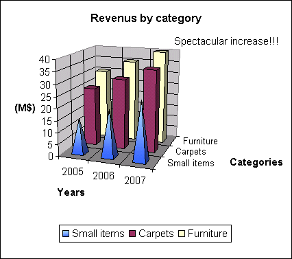
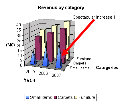
Insert free text
Apart from the main title and the axes titles, it's also possible to add text to the chart to add comments.
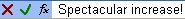
Click on the formula toolbar.
Write Spectacular increase! and press the Enter key or the button
with the green checkmark.
The text will appear in the chart. To move the text box.
Place
the cursor inside the text box.
Press the left mouse button and move the text box in the right-hand
side of the chart.
You can then change the format of the text such as its size, its color and
its orientation. Simply select the text and to choose the
first option from the Format menu or double click on the text.
Insert an arrow
Not only can you add text but also any object from the Draw toolbar. The next exercise
consists in adding an arrow to the chart to better explain a point. It's also
possible to add square, circles and several other objects. Before, continuing the Draw toolbar must be activated.
From
the View menu, select the Toolbars.
Activate
the Drawing toolbar by placing.
To move the Drawing toolbar.
Place
the cursor on the titles bar of the toolbar.
Press
the left mouse button, keep pressing it and move the bar completely to the bottom of the screen.
Release the mouse button.
To insert an arrow.
Click on the button arrows.
Place the just cursor below the text "Spectacular increase!"
Press the left mouse button and move the cursor up to the third
bar of the first data series.
Release the mouse button.
Add a series of numbers
Your are now asked to add a data series that includes the exports of the company.
Add
this last data series of numbers to your model.
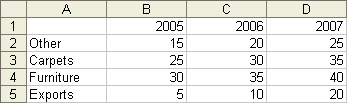
In fact, it would have been able to place these data wherever on the worksheet.
It's only the most logical place to place them. There are two ways to insert them: by using the options of for
chart or simply to "drag" the range over the chart. The next part consists in adding
a data series by using the options for charts.
Click
on the chart.
From
the Chart menu, select the Source Data option.
Click
on the Series tab.
Press
the Add button.
You'll have to enter some data in the Name and Values boxes so that the new Data series shows up on the chart.
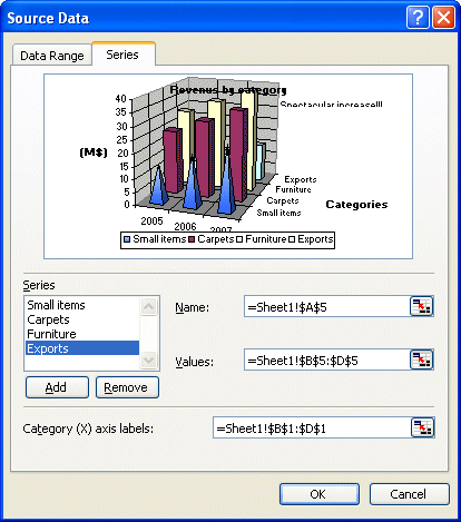
Click
in the Name box.
Write
in the Exports box.
OR
Press
the  button
at the end of the box. button
at the end of the box.
Select
the cell containing the text Exports.
Press
the button at the end of the window.
Click
in the Values box.
Press
the button
at the end of the box.
(
5 , 10 , 20) select the data series for the exports (B5 to D5).
Press
the button at the end of the window.
Because
labels for the X axis are the same than for the previous series, you don't need
to change the data.
Press the OK button.

A new data series was added to the chart. This series is however in the
back of the chart. It's hidden by all the others. You can change
the order of presentation of the series that was explained earlier on this page.
The other way of adding a data series to the chart is to select the range of values and the title (A5 to D5) and to
slide it over the chart. However, this option works only if the data and
the chart are on the same worksheet. This is impossible for the exercise
of this page. The procedure is very simple.
Select
the area of data including the title.
Press the left mouse button and move the selection over the chart.
Once over the chart, the cursor should change and show a "+" sign next to the
cursor.
Release the mouse button.
The selected series will appear on the chart.
Insert a second Y axis
Excel makes possible the addition of a second Y axis on the right-hand side
of the chart. This allows you to compare values of different proportions. For
example, it would be very difficult to compare millions of units sold to the
percentage of market shares. This option is only available for charts
with two dimensions (2D). Before demonstrating you this option, it
will so be necessary to change type of chart.
Remove the ''Spectacular increase'' text and the arrow.
From
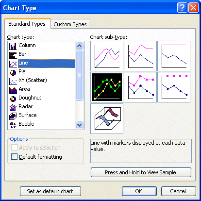
the Chart menu, select the Type of chart option.
Select
the type of chart according to the picture above.
Press the OK button.
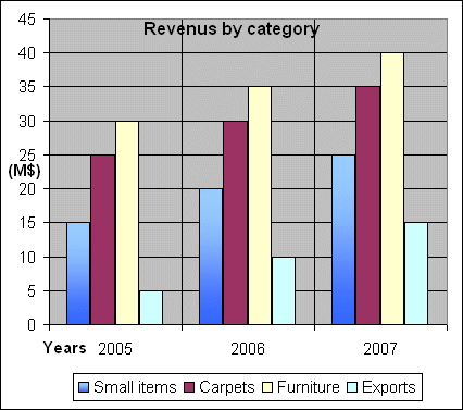
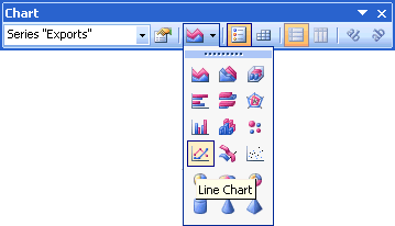
For this exercise, we will presume that the data series Exports needs to be on a second axis.
Select
the series Exports by clicking one of the bars of the series.
Be careful!
All the bars of the series should be selected. Otherwise, click somewhere
else the chart and select once again the Exports series.
From
the Format menu, select the option Selected Data Series.
OR
Double-click
on the series.
OR
From
the chart toolbar, select the item Series "Exports".
Press
then on the button.
Select
the Selected Data Series tab.
Activate
the Secondary Axis option.
Excel offers you a preview of the chart. You can change this option or the
others concerning the data series.
Press the OK button.
The Export data series is now visible beside the other date series of the chart. It has its own
Y axis on the right-hand side of the chart.
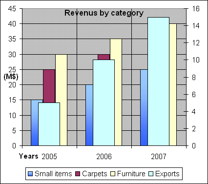
To be able to better compare the data series Exports of the others,
it would be preferable to change the type of chart for it. It
will be changed the type of Line chart.
Select
the Exports series with one of the techniques mentioned above.
Select
the type of chart for only this Data series by selecting a Line with markers for the type of chart.
Press the OK button.
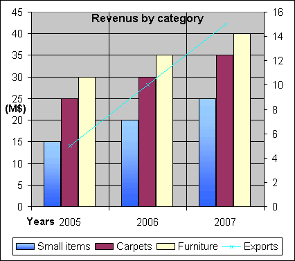
Here is the chart under its final format. It's now easier to distinguish the
series and to compare them. There was also another way of changing the type of
chart for one or all the data series. But you can't mix 2D with 3D charts or some types of chart with others.
Select
the data series or the chart in its entirety according to your needs.
From
the Chart toolbar, select the type of chart of your choice.
There are some types of predefined charts having two axes.
From
the Chart menu, select the Type of chart option.
Select
the Custom Types tab.
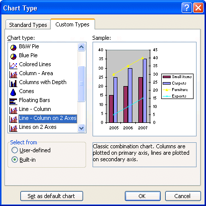
Of the list of the types of charts, there are two that have two axes:
Line - Column on 2 axes and Rows on 2 Axes.
Press the Cancel button.
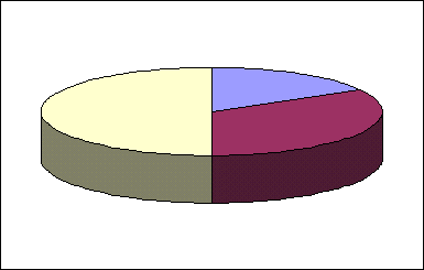
"Explode" a part of a pie chart
The "Pie" charts are
mostly used to demonstrate proportions or shares. But you may wish to
highlight a point of the pie to put it more interest on it. Before being able to
"explode" a point, you must create a pie chart.
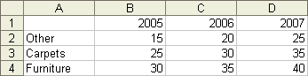
Enter
the following data in a worksheet.

Make
a block with the range of data.
Press
the chart button .
From the list of chart types, select Pie.
Select
the Pie with a 3-D visual effect option (second option).
Press
the Next button twice.
Press
the Legend tab.
Unselect
the View the legend option.
Press
the End button.
The "3-D Pie chart" will appear in the frame that
you created. Otherwise, begin again the steps above.
 |
Press
the left mouse button, keep pressing it, and move the part towards the outside of the pie.
Release
the mouse button when you'll have moved the part to the new location of
your choice.
|
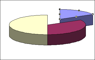
It's as easy as pie to split a pie chart! Sorry! I couldn't resist the pun.
Print only a chart
It's always possible
to you to print the chart alone on a page even if it's next to numbers and to formulas.
Click
on the chart you wish to print.
All the options of the menus will fit to give the possibilities of
the chart; including the printing. If you don't click the chart, the page setup
and printing will show you the chart and the numbers of the worksheet
instead of only the chart.
To
have a print preview of your chart, press the  button. button.
OR
From
the File menu, select the Print Preview option.
You can use the same page setup and printing options as you set for the
printing of the worksheets. Make sure to always preview before the
printing. If you want to print just the chart, trust the preview
of the chart. Although the chart seems correct with your data, it's the print preview that gives the best representation on to paper.
Press
the Setup button.
They are the options of pagination for the chart. They are almost identical
to those for the pagination for the file with the exception of the last tab:
chart.
Click
on the Chart tab.
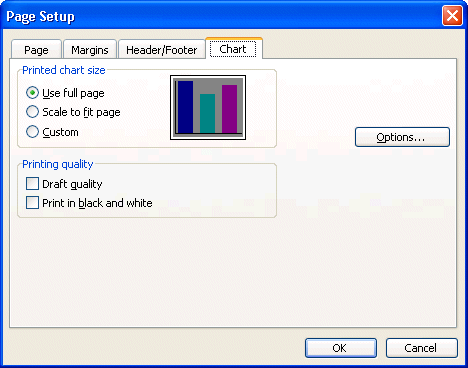
The chart size option allows you to determine the size that it will
take on paper. The "Use full page" option ajust the chart to take advantage of the whole page. The option "Scale to fit page" takes just advantage of the width of the page. The "Custom"
option keeps the chart the same size as on the worksheet.
The print quality options allow you some control over the chart's printing.
The "Draft quality" option is faster and uses less ink or toner. The "Print in black and white" option is for dot matrix printers. This helps
to make the distinction between each of the data series of the chart.
The Options... button will show you the available options of the printer.
The contents of these tabs vary according to the type of printer that's available.
These tabs help to :
 Determine
the paper format as well as the page orientation. Determine
the paper format as well as the page orientation.
Determine
the printing quality, or resolution in dot per inch (dpi), of a chart.
Determine
the way that fonts will be printed.
Because the contents vary according to the printer, it's up to you to select from
the options that are offered. |