 |
||
Navigation Topics Excercises Tutorials Others Contact Share this page |
Excel - Create a demographics chart
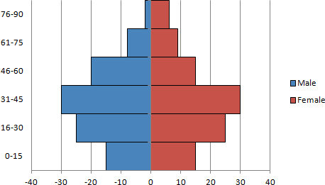
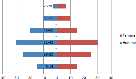
You must have seen a demographics chart like the one above and wondered how to make your own. This page will show you how to do it step by step.
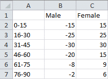
In this case, there is one column of data for male and another for females. All the values in one of the data ranges must be positive and the other negative. It does not matter witch is witch. However, the negative values will appear to the left of the center (zero value) and the positive values to the right of the zero value |
|
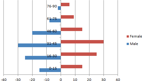
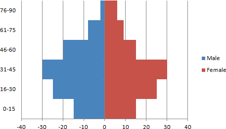
As you can see, the chart is not yet completed. There are still a few more steps to go through before the final result.
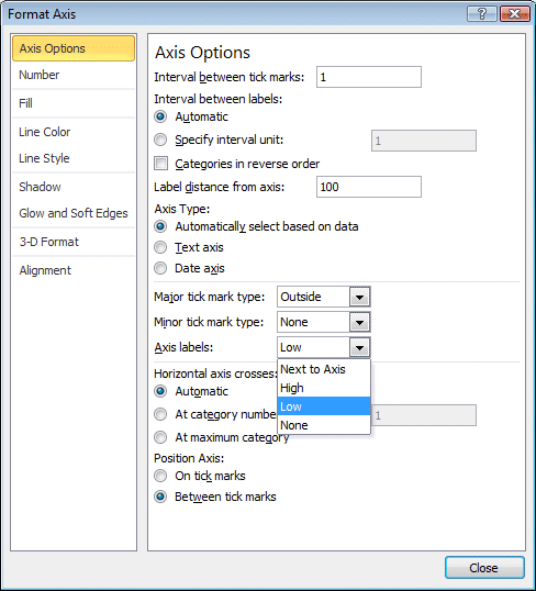
The last commands were necessary to align both series of data. At this point, the male data is on the right of the chart and the female data is on the left. Each is using different axis labels. The next step is to regroup all these values on to a single axis.
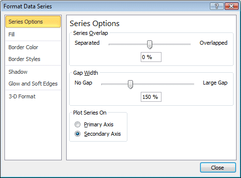
All the data will realign according the axis below the chart. Except that, the vertical axis is in the middle of the chart. The next steps consist on moving it to the left of the chart.
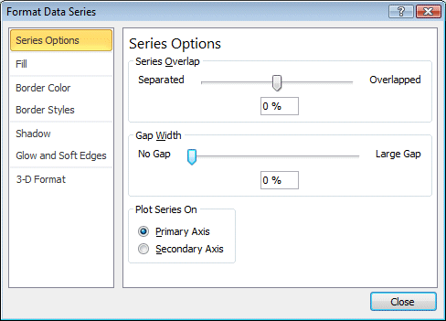
The chart is almost complete. The next step consists of removing the space between the data bars.
There is one last step to complete the chart. Every data point needs a border to better differentiate it from the others.
The demographics chart is now complete. You can now create your own demographics chart. |


| You like what you read?
Share it with your friends. |