 |
||
Navigation Topics Excercises Tutorials Others Contact Share this page |
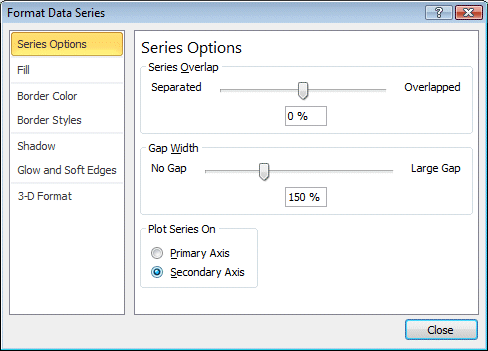
Excel - Add a second axis to a chartOn occasion, it's better to present a data series on a second axis. The reason is because of the difference in scale between two data series or more. This page will show you how to activate a secondary axis for your charts.
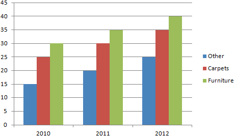
The Market share data series will be added later.
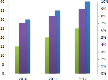
This is what the chart should look like.
|
|

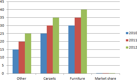
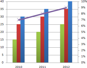
This is how it would look if you added the market share data.
You can see that the axis have turned. The years are no longer on the X axis (horizontal). You could go to the Chart tools' Design tab and press the Switch Row/Column button to fix this. But there is another way to add data to a chart in Excel/2010.
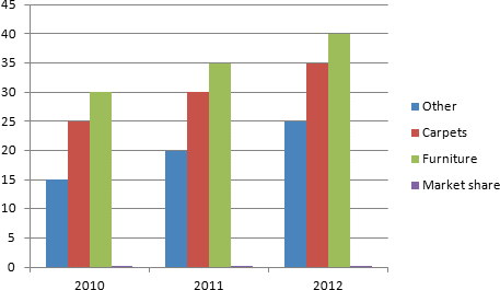
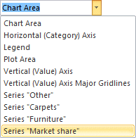
As you can see, it's hard to interpret the Market share data series even when you try to compare it to values ranging from 15 to 40. Imagine, how hard it would be if the values where in the millions or more. In this case, adding a second axis from the Market share data is necessary. Here are the steps to activate it.
|
| You like what you read?
Share it with your friends. |